
npx create-react-app alertdemo
cd alertdemo
npm i notyf
Notyf is a minimalistic JavaScript library for toast notifications. It is responsive, A11Y compatible, dependency-free, and has a very lightweight footprint (~3KB). Notyf can be easily integrated with React, Angular, Aurelia, Vue, and Svelte.
Features
- Responsive
- A11Y compatible
- Strongly typed codebase (TypeScript Typings readily available)
- 4 types of bundles exposed: ES6, CommonJS, UMD, and IIFE (for vanilla, framework-free usage).
- End-to-end testing with Cypress
- Easily plugable to modern frameworks. Recipes available to integrate with React, Angular, Aurelia, Vue, and Svelte.
- Optional ripple-like fancy revealing effect
- Simple but highly extensible API. Create your own toast types and customize them.
- Support to render custom HTML content within the toasts
- Tiny footprint (<3K gzipped)
- Works on IE11
Usage in Browser
<html>
  <head>
    ...
    <link rel="stylesheet" href="https://cdn.jsdelivr.net/npm/notyf@3/notyf.min.css">
  </head>
  <body>
    ...
    <script src="https://cdn.jsdelivr.net/npm/notyf@3/notyf.min.js"></script>
  </body>
</html>
Basic Alert Messages in JavaScript
// Create an instance of Notyf
var notyf = new Notyf();

// Display an error notification
notyf.error('You must fill out the form before moving forward');

// Display a success notification
notyf.success('Your changes have been successfully saved!');
Examples
Global Configuration
The following example configures Notyf with the following settings:
- 1s duration
- Render notifications in the top-right corner
- New custom notification called ‘warning’ with a ligature material icon
- Error notification with custom duration, color and dismiss button
const notyf = new Notyf({
  duration: 1000,
  position: {
    x: 'right',
    y: 'top',
  },
  types: [
    {
      type: 'warning',
      background: 'orange',
      icon: {
        className: 'material-icons',
        tagName: 'i',
        text: 'warning'
      }
    },
    {
      type: 'error',
      background: 'indianred',
      duration: 2000,
      dismissible: true
    }
  ]
});
Custom toast type
const notyf = new Notyf({
types: [
{
type: 'info',
background: 'blue',
icon: false
}
]
});
notyf.open({
type: 'info',
message: 'Send us <b>an email</b> to get support'
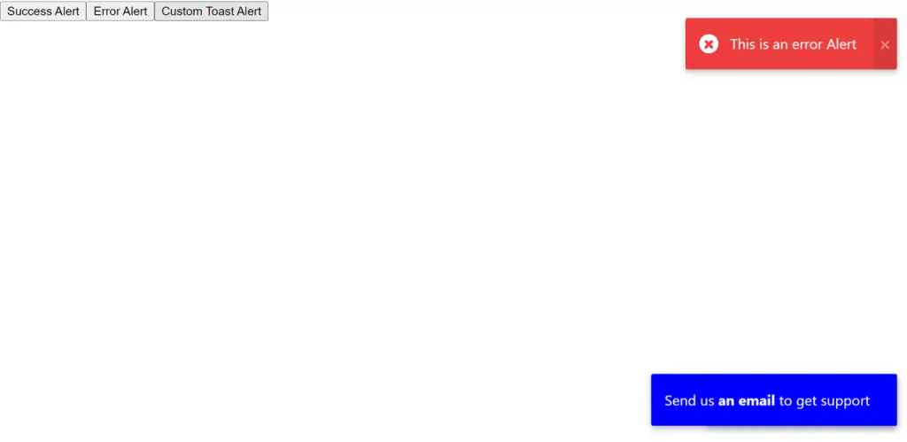
});Full Source Code to Show Alert Notification Messages Using React.js Notyf Library
App.js
import React from 'react'

import { Notyf } from 'notyf';
import 'notyf/notyf.min.css'; // for React, Vue and Svelte

function App() {


  const notyf = new Notyf();

  const successAlert = () => {

    notyf.success("This is a basic Alert")

  }

  const errorAlert = () => {
    let error = new Notyf({
      duration:1000,
      position:{
        x:'right',
        y:'top'
      },
      dismissible:true
    })
    error.error("This is an error Alert")
  }

  const customAlert = () => {
    const notyf = new Notyf({
      types: [
        {
          type: 'custom',
          background: 'blue',
          icon: false
        }
      ]
    });

    notyf.open({
      type: 'custom',
      message: 'Send us <b>an email</b> to get support'
    });
  }
  return (
    <div>
      <button onClick={successAlert}>Success Alert</button>
      <button onClick={errorAlert}>Error Alert</button>
      <button onClick={customAlert}>Custom Toast Alert</button>
    </div>
  )
}

export default App
Screenshot