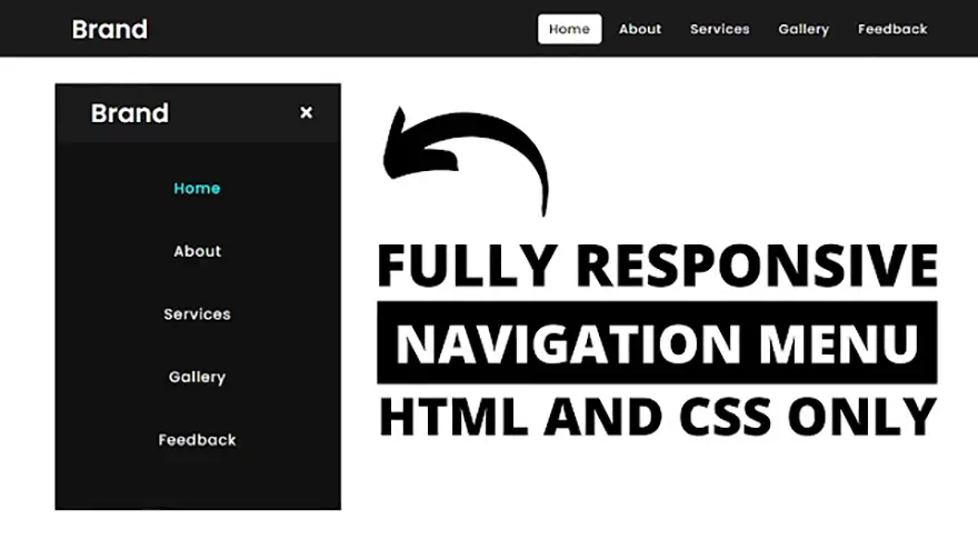
In this tutorial, I will teach you how to design a responsive navigation menu bar using only HTML5 & CSS3. The complete source code of this responsive HTML5 menu is given below.
HTML5 & CSS3 Responsive Menu Source Code
index.html
<!DOCTYPE html>
<html lang="en" dir="ltr">
   <head>
      <meta charset="utf-8">
      <title>Responsive Navigation Menu</title>
      <link rel="stylesheet" href="style.css">
      <link rel="stylesheet" href="https://cdnjs.cloudflare.com/ajax/libs/font-awesome/5.15.3/css/all.min.css"/>
      <meta name="viewport" content="width=device-width, initial-scale=1.0">
   </head>
   <body>
      <nav>
         <div class="logo">
            Brand
         </div>
         <input type="checkbox" id="click">
         <label for="click" class="menu-btn">
         <i class="fas fa-bars"></i>
         </label>
         <ul>
            <li><a class="active" href="#">Home</a></li>
            <li><a href="#">About</a></li>
            <li><a href="#">Services</a></li>
            <li><a href="#">Gallery</a></li>
            <li><a href="#">Feedback</a></li>
         </ul>
      </nav>
      <div class="content">
         <div>
            Responsive Navigation Menu Bar Design
         </div>
         <div>
            using only HTML & CSS
         </div>
      </div>
   </body>
</html>
style.css
@import url('https://fonts.googleapis.com/css?family=Poppins:400,500,600,700&display=swap');
*{
  margin: 0;
  padding: 0;
  box-sizing: border-box;
  font-family: 'Poppins', sans-serif;
}
nav{
  display: flex;
  height: 80px;
  width: 100%;
  background: #1b1b1b;
  align-items: center;
  justify-content: space-between;
  padding: 0 50px 0 100px;
  flex-wrap: wrap;
}
nav .logo{
  color: #fff;
  font-size: 35px;
  font-weight: 600;
}
nav ul{
  display: flex;
  flex-wrap: wrap;
  list-style: none;
}
nav ul li{
  margin: 0 5px;
}
nav ul li a{
  color: #f2f2f2;
  text-decoration: none;
  font-size: 18px;
  font-weight: 500;
  padding: 8px 15px;
  border-radius: 5px;
  letter-spacing: 1px;
  transition: all 0.3s ease;
}
nav ul li a.active,
nav ul li a:hover{
  color: #111;
  background: #fff;
}
nav .menu-btn i{
  color: #fff;
  font-size: 22px;
  cursor: pointer;
  display: none;
}
input[type="checkbox"]{
  display: none;
}
@media (max-width: 1000px){
  nav{
    padding: 0 40px 0 50px;
  }
}
@media (max-width: 920px) {
  nav .menu-btn i{
    display: block;
  }
  #click:checked ~ .menu-btn i:before{
    content: "\f00d";
  }
  nav ul{
    position: fixed;
    top: 80px;
    left: -100%;
    background: #111;
    height: 100vh;
    width: 100%;
    text-align: center;
    display: block;
    transition: all 0.3s ease;
  }
  #click:checked ~ ul{
    left: 0;
  }
  nav ul li{
    width: 100%;
    margin: 40px 0;
  }
  nav ul li a{
    width: 100%;
    margin-left: -100%;
    display: block;
    font-size: 20px;
    transition: 0.6s cubic-bezier(0.68, -0.55, 0.265, 1.55);
  }
  #click:checked ~ ul li a{
    margin-left: 0px;
  }
  nav ul li a.active,
  nav ul li a:hover{
    background: none;
    color: cyan;
  }
}
.content{
  position: absolute;
  top: 50%;
  left: 50%;
  transform: translate(-50%, -50%);
  text-align: center;
  z-index: -1;
  width: 100%;
  padding: 0 30px;
  color: #1b1b1b;
}
.content div{
  font-size: 40px;
  font-weight: 700;
}