In Angular 10, its developers have introduced a new Date Range Picker, that looks cool!!!
Recently, I managed to understand its code and now I’m going to share my knowledge with you guys through a step by step example.
In this tutorial, we will be creating an Angular Material Date Range Picker. So, let’s get ready and follow along with me.
Getting Started
First of all, set up a new Angular 10 project.
For that, you need Node.js and npm installed on your computer. The latest version of Node.js is already packed with npm, so you don’t need to install it separately.
Type this command to install Angular CLI globally.
npm install -g @angular/cli
Now, create a workspace and provide the name of your application. Replace “angular10-date-picker” with any other name if you like.
ng new angular10-date-picker
Then, add Material Design components in our Angular 10 app.
ng add @angular/material
Type below command to compile the Angular 10 application.
ng serve
Edit app.module.ts File
After compilation, open /src/app/app.module.ts file. We need to import a few things here.
import { MatDatepickerModule } from '@angular/material/datepicker';
import { MatNativeDateModule } from '@angular/material/core';
import { MatFormFieldModule } from '@angular/material/form-field';
import { ReactiveFormsModule } from '@angular/forms';
Also add them inside the @NgModule imports option.
@NgModule({
  declarations: [
    AppComponent
  ],
  imports: [
    BrowserModule,
    BrowserAnimationsModule,
    MatDatepickerModule,
    MatNativeDateModule,
    MatFormFieldModule,
    ReactiveFormsModule
  ],
  providers: [],
  bootstrap: [AppComponent]
})
Finally, /src/app/app.module.ts file will look something like this.
import { BrowserModule } from '@angular/platform-browser';
import { NgModule } from '@angular/core';

import { AppComponent } from './app.component';
import { BrowserAnimationsModule } from '@angular/platform-browser/animations';

import { MatDatepickerModule } from '@angular/material/datepicker';
import { MatNativeDateModule } from '@angular/material/core';
import { MatFormFieldModule } from '@angular/material/form-field';
import { ReactiveFormsModule } from '@angular/forms';


@NgModule({
  declarations: [
    AppComponent
  ],
  imports: [
    BrowserModule,
    BrowserAnimationsModule,
    MatDatepickerModule,
    MatNativeDateModule,
    MatFormFieldModule,
    ReactiveFormsModule
  ],
  providers: [],
  bootstrap: [AppComponent]
})
export class AppModule { }
Edit app.component.ts File
Open /src/app/app.component.ts file. Here, we need to add a range using new FormGroup(). Let’s have a look at the final contents of this file.
import { Component } from '@angular/core';
import { FormControl, FormGroup } from '@angular/forms';

@Component({
  selector: 'app-root',
  templateUrl: './app.component.html',
  styleUrls: ['./app.component.css']
})
export class AppComponent {
  title = 'angular10-date-picker';

  range = new FormGroup({
    start: new FormControl(),
    end: new FormControl()
  });
}
Edit app.component.html File
This file is located at: /src/app/app.component.html
Remove existing boilerplate code from this file. We will be writing our own code here.
Anyways, here’s the final code for this file.
<mat-form-field appearance="outline">
<mat-label>Select Date Range</mat-label>
<mat-date-range-input [rangePicker]="picker" [formGroup]="range">
<input matStartDate placeholder="Start Date" formControlName="start">
<input matEndDate placeholder="End Date" formControlName="end">
</mat-date-range-input>
<mat-datepicker-toggle matSuffix [for]="picker"></mat-datepicker-toggle>
<mat-date-range-picker #picker></mat-date-range-picker>
</mat-form-field>
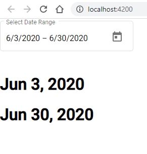
<h1>{{range.value.start | date}}</h1>
<h1>{{range.value.end | date}}</h1>
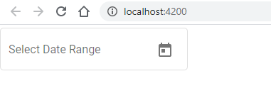
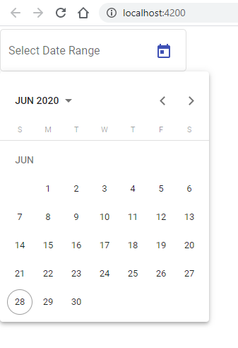
View Output in Web Browser
As we have already compiled this project in the “Getting Started” section. It’s time to open your favorite web browser and view the Angular 10 Date Range Picker.
Most of the time Angular project is using port 4200. So, to view it, type below link in your web browser’s address bar.
http://localhost:4200/
Screenshots
Conclusion
That’s it for now. I hope you are now familiar with how to add a Date Range Picker in your Angular 10 project. If you have any questions regarding the above source code then do let me know in the comments below.
Please support me by sharing this article on your social media.
See you in the next article!
How to add the Presets like Yesterday, Last 7 days, This month. ?
I am impressed to know your thoughts on the subject. You always surprise me.
Thanks