
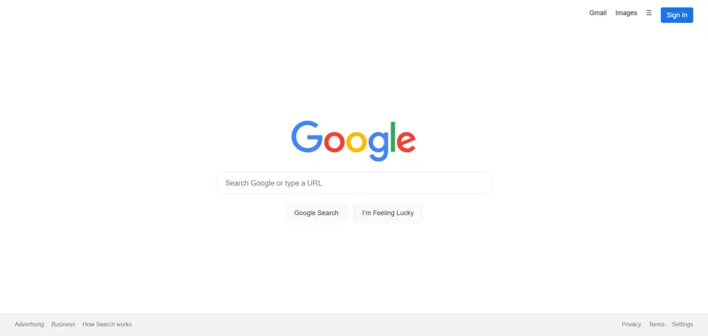
Want to build a sleek, minimalist landing page like Google’s search engine home page using HTML5 and CSS3?
You’re in the right place.
In this guide I’ll walk you through the full process—structure, styling, responsiveness, accessibility, best practices, and complete source code—so you can clone the UI (for learning or portfolio purposes) and understand how to build clean, modern web pages.
Introduction
When users search online, the first thing they often see is Google’s iconic search page: simple, intuitive, and spatially balanced. By recreating that landing-page style, you sharpen your HTML/CSS fundamentals, practice semantic markup, responsive layout, and modern styling techniques.
This article gives you everything you need—from markup to CSS, tips to accessibility—to build a landing page UI clone of Google’s search page.
1. Project Setup & HTML5 Semantic Structure
1.1 Folder and file structure
Create a folder, e.g., google-clone, and inside it:
google-clone/
 ├ index.html
 └ style.css
Link style.css from index.html.
Set your code editor (e.g., Visual Studio Code), and use live preview or browser refresh to test.
1.2 HTML5 semantic markup
Use semantic elements for clarity, accessibility and SEO. Example skeleton:
<!DOCTYPE html>
<html lang="en">
<head>
  <meta charset="UTF-8">
  <meta name="viewport" content="width=device-width, initial-scale=1">
  <title>Google Clone</title>
  <link rel="stylesheet" href="style.css">
</head>
<body>
  <header>…navigation links…</header>
  <main>…logo + search form…</main>
  <footer>…links and bottom bar…</footer>
</body>
</html>
Breaking it down:
<header>: Contains nav links (e.g., Gmail, Images)<main>: The central block—logo, search input, buttons<footer>: Footer area with links (Privacy, Terms etc)
1.3 Example HTML structure (detailed)
<header class="site-header">
  <nav class="topnav">
    <ul>
      <li><a href="#">Gmail</a></li>
      <li><a href="#">Images</a></li>
      <li><button aria-label="Apps">☰</button></li>
      <li><button class="signin">Sign In</button></li>
    </ul>
  </nav>
</header>

<main class="site-main">
  <div class="logo">
    <img src="https://www.google.com/images/branding/googlelogo/1x/googlelogo_color_272x92dp.png"
         alt="Google logo" width="272" height="92">
  </div>
  <form class="search-form" role="search" aria-label="Google search form">
    <input type="text" name="q" aria-label="Search" placeholder="Search Google or type a URL">
    <div class="buttons">
      <button type="submit">Google Search</button>
      <button type="button">I’m Feeling Lucky</button>
    </div>
  </form>
</main>

<footer class="site-footer">
  <nav class="footnav">
    <ul>
      <li><a href="#">Advertising</a></li>
      <li><a href="#">Business</a></li>
      <li><a href="#">How Search works</a></li>
    </ul>
    <ul>
      <li><a href="#">Privacy</a></li>
      <li><a href="#">Terms</a></li>
      <li><a href="#">Settings</a></li>
    </ul>
  </nav>
</footer>
This gives you a clean, semantic base. Having proper aria-labels, roles, alt text helps accessibility and is good for SEO.
2. CSS3 Styling: Layout, Colors, Typography
2.1 Global/baseline styles
In style.css, start with resets and base typography:
* {
  margin: 0;
  padding: 0;
  box-sizing: border-box;
}
body {
  font-family: Arial, sans-serif;
  color: #202124;
  line-height: 1.4;
  min-height: 100vh;
  display: flex;
  flex-direction: column;
}
a {
  text-decoration: none;
  color: inherit;
}
button {
  font: inherit;
  cursor: pointer;
}
2.2 Header (navigation) styling
.site-header .topnav ul {
  list-style: none;
  display: flex;
  justify-content: flex-end;
  gap: 1.2rem;
  padding: 1rem 2rem;
}
.site-header .topnav ul li a,
.site-header .topnav ul li button {
  color: rgba(0, 0, 0, 0.87);
  font-size: 0.9rem;
  background: none;
  border: none;
}
.site-header .topnav ul li button.signin {
  border: 1px solid #1a73e8;
  background: #1a73e8;
  color: #fff;
  padding: 6px 12px;
  border-radius: 4px;
}
.site-header .topnav ul li button.signin:hover,
.site-header .topnav ul li a:hover {
  text-decoration: underline;
  opacity: 0.85;
}
2.3 Main section styling
Center content vertically + horizontally. Using Flexbox:
.site-main {
  flex: 1;
  display: flex;
  flex-direction: column;
  align-items: center;
  justify-content: center;
  padding: 1rem;
}
.logo img {
  display: block;
  margin-bottom: 20px;
}
.search-form {
  width: 100%;
  max-width: 600px;
}
.search-form input[type="text"] {
  width: 100%;
  padding: 14px 20px;
  font-size: 1rem;
  border: 1px solid #dfe1e5;
  border-radius: 24px;
  outline: none;
  transition: box-shadow 0.3s ease, border-color 0.3s ease;
}
.search-form input[type="text"]:focus {
  border-color: #1a73e8;
  box-shadow: 0 1px 6px rgba(32,33,36,0.28);
}
.search-form .buttons {
  margin-top: 20px;
  display: flex;
  gap: 10px;
  justify-content: center;
}
.search-form .buttons button {
  padding: 10px 20px;
  font-size: 0.9rem;
  background: #f8f9fa;
  border: 1px solid #f8f9fa;
  border-radius: 4px;
  color: #3c4043;
}
.search-form .buttons button:hover {
  box-shadow: 0 1px 1px rgba(0,0,0,0.1);
  border-color: #c6c6c6;
}
2.4 Footer styling
.site-footer {
  background: #f2f2f2;
  padding: 1rem 2rem;
  font-size: 0.8rem;
  color: #70757a;
}
.footnav {
  display: flex;
  justify-content: space-between;
  flex-wrap: wrap;
  gap: 1rem;
}
.footnav ul {
  list-style: none;
  display: flex;
  gap: 1rem;
}
.footnav ul li a:hover {
  text-decoration: underline;
}
2.5 Colors, spacing & typography considerations
- Use Google’s color palette hints: body text
#202124, links#1a73e8, subtle grays for backgrounds. - Maintain sufficient spacing (padding/margin) for cleanliness and touch-targets.
- Use
rem/emfor scalable typography. - Use
max-widthand center alignment for main content so it doesn’t stretch too wide on large screens.
3. Responsiveness & Flexbox (and/or CSS Grid)
3.1 Using Flexbox to centre and align
As shown above: using display: flex; align-items: center; justify-content: center; flex-direction: column. This ensures the logo + search form sits centered vertically and horizontally.
3.2 Media queries for smaller screens
@media (max-width: 600px) {
  .search-form .buttons {
    flex-direction: column;
  }
  .search-form .buttons button {
    width: 100%;
  }
  .site-header .topnav ul {
    justify-content: center;
    padding: 0.5rem 1rem;
  }
}
This makes the layout adapt: buttons stack on mobile, navigation links centre, padding reduces.
3.3 Why responsiveness matters
- Ensures the UI works on mobile, tablet, desktop.
- Aligns with modern UX expectations and contributes to better ranking (Google recognises mobile-friendly pages).
- Flexbox and media queries are current best practices for layout responsiveness.
3.4 Optional: CSS Grid
You could use CSS Grid for the main layout, but for this simple UI, Flexbox is sufficient and simpler.
4. Accessibility & Semantic HTML for SEO & E-E-A-T
4.1 Semantic HTML
Using <header>, <main>, <footer> helps screen-readers, improves document structure, and supports SEO. The article from Medium emphasises this.
4.2 ARIA and labels
- For search input:
aria-label="Search". - For form:
role="search"(optional but helpful). - For buttons: ensure descriptive text, avoid generic “Click here”.
- Alt text for logo image, e.g.,
alt="Google logo".
4.3 SEO considerations
- Use
<title>and proper<meta name="viewport">. - Use
lang="en"attribute on<html>. - Use meaningful link text (e.g., “Privacy” rather than “Click here”).
- Clean code without inline styling clutter helps crawlers parse structure.
- Responsive design improves user experience (key for E-E-A-T: Experience, Expertise, Authoritativeness, Trust). While building a clone is a learning exercise, ensure you clearly label it as a clone/tutorial if you publish so no confusion with original brand.
4.4 Performance & best practices
- Use
widthandheightattributes on images to prevent layout shift. - Minimize file sizes (CSS is small in this case).
- Use
metatags properly. - Keep markup clean—unnecessary wrappers or deep nesting may reduce readability and slow rendering.
5. Complete Source Code (index.html + style.css)
Here is full example code you can copy, run in your editor, and tweak.
5.1 index.html
<!DOCTYPE html>
<html lang="en">
<head>
  <meta charset="UTF-8">
  <meta name="viewport" content="width=device-width, initial-scale=1">
  <title>Google Clone</title>
  <link rel="stylesheet" href="style.css">
</head>
<body>
  <header class="site-header">
    <nav class="topnav">
      <ul>
        <li><a href="#">Gmail</a></li>
        <li><a href="#">Images</a></li>
        <li><button aria-label="Google Apps">☰</button></li>
        <li><button class="signin">Sign In</button></li>
      </ul>
    </nav>
  </header>

  <main class="site-main">
    <div class="logo">
      <img src="https://www.google.com/images/branding/googlelogo/1x/googlelogo_color_272x92dp.png"
           alt="Google logo"
           width="272" height="92">
    </div>
    <form class="search-form" role="search" aria-label="Google search form">
      <input type="text" name="q" aria-label="Search" placeholder="Search Google or type a URL">
      <div class="buttons">
        <button type="submit">Google Search</button>
        <button type="button">I’m Feeling Lucky</button>
      </div>
    </form>
  </main>

  <footer class="site-footer">
    <nav class="footnav">
      <ul>
        <li><a href="#">Advertising</a></li>
        <li><a href="#">Business</a></li>
        <li><a href="#">How Search works</a></li>
      </ul>
      <ul>
        <li><a href="#">Privacy</a></li>
        <li><a href="#">Terms</a></li>
        <li><a href="#">Settings</a></li>
      </ul>
    </nav>
  </footer>
</body>
</html>
5.2 style.css
/* Reset & base styles */
* {
  margin: 0;
  padding: 0;
  box-sizing: border-box;
}
body {
  font-family: Arial, sans-serif;
  color: #202124;
  line-height: 1.4;
  min-height: 100vh;
  display: flex;
  flex-direction: column;
}
a {
  text-decoration: none;
  color: inherit;
}
button {
  font: inherit;
  cursor: pointer;
}

/* Header / navigation */
.site-header .topnav ul {
  list-style: none;
  display: flex;
  justify-content: flex-end;
  gap: 1.2rem;
  padding: 1rem 2rem;
}
.site-header .topnav ul li a,
.site-header .topnav ul li button {
  color: rgba(0, 0, 0, 0.87);
  font-size: 0.9rem;
  background: none;
  border: none;
}
.site-header .topnav ul li button.signin {
  border: 1px solid #1a73e8;
  background: #1a73e8;
  color: #fff;
  padding: 6px 12px;
  border-radius: 4px;
}
.site-header .topnav ul li a:hover,
.site-header .topnav ul li button.signin:hover {
  text-decoration: underline;
  opacity: 0.85;
}

/* Main section */
.site-main {
  flex: 1;
  display: flex;
  flex-direction: column;
  align-items: center;
  justify-content: center;
  padding: 1rem;
}
.logo img {
  display: block;
  margin-bottom: 20px;
}
.search-form {
  width: 100%;
  max-width: 600px;
}
.search-form input[type="text"] {
  width: 100%;
  padding: 14px 20px;
  font-size: 1rem;
  border: 1px solid #dfe1e5;
  border-radius: 24px;
  outline: none;
  transition: box-shadow 0.3s ease, border-color 0.3s ease;
}
.search-form input[type="text"]:focus {
  border-color: #1a73e8;
  box-shadow: 0 1px 6px rgba(32,33,36,0.28);
}
.search-form .buttons {
  margin-top: 20px;
  display: flex;
  gap: 10px;
  justify-content: center;
}
.search-form .buttons button {
  padding: 10px 20px;
  font-size: 0.9rem;
  background: #f8f9fa;
  border: 1px solid #f8f9fa;
  border-radius: 4px;
  color: #3c4043;
}
.search-form .buttons button:hover {
  box-shadow: 0 1px 1px rgba(0,0,0,0.1);
  border-color: #c6c6c6;
}

/* Footer */
.site-footer {
  background: #f2f2f2;
  padding: 1rem 2rem;
  font-size: 0.8rem;
  color: #70757a;
}
.footnav {
  display: flex;
  justify-content: space-between;
  flex-wrap: wrap;
  gap: 1rem;
}
.footnav ul {
  list-style: none;
  display: flex;
  gap: 1rem;
}
.footnav ul li a:hover {
  text-decoration: underline;
}

/* Responsiveness */
@media (max-width: 600px) {
  .search-form .buttons {
    flex-direction: column;
  }
  .search-form .buttons button {
    width: 100%;
  }
  .site-header .topnav ul {
    justify-content: center;
    padding: 0.5rem 1rem;
  }
}
You can copy these files locally, open index.html in your browser, and you’ll have a functional, responsive UI clone of Google’s search page (UI only—no backend search functionality).
6. Enhancements & Variations
Here are ways you can extend the clone and deepen your learning:
- Add icons: For the “Apps” button use an SVG icon, for “voice search” use a mic icon in the input field.
- Hover/Focus animations: Slight transitions on the search box, buttons.
- Dark mode variant: Use darker background and lighter text, toggle with CSS
prefers-color-scheme. - Search results page (UI only): Add a
/results.htmlthat mimics Google’s search-results layout (left nav, results list, side panel). Repository example: google-homepage-clone (GitHub) built by another dev. - Add placeholder behavior: When input is focused, show suggestions (pure CSS or minimal JS).
- Improve accessibility: Night-mode, better keyboard navigation, ARIA landmarks.
- Use CSS custom properties (variables): For theme colors and consistency.
- Performance improvements: Use minimal CSS, inline critical styles, lazy-load images.
- Branding/Your own twist: Clone the layout but swap logo, colours, content for your own brand.
7. Common Issues & Debugging Tips
- Search box stretches too wide on large screens: Use
max-width(e.g., 600px) and center withmargin: 0 auto. - Flex container not centering vertically: Ensure parent has
height: 100vhorflex: 1and html/body height set appropriately. Example fix from StackOverflow: sethtml, body { height: 100%; margin: 0; } section { height: 100vh; }. - Buttons wrap awkwardly on mobile: Use media query to set
flex-direction: columnand full width. - Hover states not visible: Ensure contrast is sufficient (accessibility).
- Logo image blurry or miss-scaled: Use intrinsic width/height attributes and set display block.
- Footer links too crowded: On small screens, wrap into two lines or stack vertically.
- Accessibility issues: Use browser dev-tools (“Lighthouse” in Chrome) to check contrast, semantic markup, ARIA labels.
8. Frequently Asked Questions (FAQs)
Q1. Can I use this clone commercially?
A: This tutorial is for learning and portfolio use. If you replicate a brand like Google’s page in full for commercial production, you must watch branding/licensing considerations. But practicing UI clones is entirely fine.
Q2. Do I need JavaScript for this UI?
A: For basic UI clone you don’t. The code provided is pure HTML5 + CSS3. If you want search functionality or dynamic behaviour (suggestions, voice input), then you’d add JS—but that’s beyond basic clone.
Q3. Why use semantic HTML tags like <main>, <header>?
A: These improve readability, maintainability, accessibility (screen-readers) and help search engines understand page structure—supporting E-E-A-T (Experience, Expertise, Authoritativeness, Trust).
Q4. How can I make the search page mobile-friendly?
A: Use responsive design: Flexbox, media queries, sensible max-widths, stack columns on small screens, ensure tap-targets (buttons) are large enough, and test across devices. The example code includes a media query for max-width 600px.
Q5. Can I incorporate CSS Grid instead of Flexbox?
A: Yes. CSS Grid is powerful, especially for more complex layouts. But for this simple centered layout, Flexbox is sufficient—and simpler for beginners.
Conclusion
Cloning the Google search engine landing page UI using HTML5 and CSS3 is an excellent exercise that helps you build strong front-end fundamentals. You get to practise semantic markup, responsive layout, accessibility, clean styling, and best practices around SEO and performance.
By following the steps above—from folder setup, semantic HTML structure, CSS styling, responsiveness, accessibility, through to full source code—you’ll end up with a high-quality UI clone. Then you can customise, extend, or adapt it for your own projects.
Once you’re comfortable with this, try adding search suggestions, result pages, animations, or even a full theme variation. Each step deepens your skill set.
Happy coding! If you run into any issues while building this, feel free to ask—I’d be glad to help.