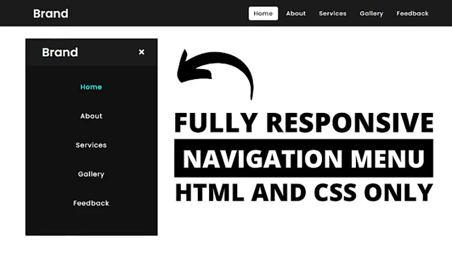
In this tutorial, I will teach you how to design a responsive navigation menu bar using only HTML5 & CSS3. The complete source code of this responsive HTML5 menu is given below.
<!DOCTYPE html>
<html lang="en" dir="ltr">
   <head>
      <meta charset="utf-8">
      <title>Responsive Navigation Menu</title>
      <link rel="stylesheet" href="style.css">
      <link rel="stylesheet" href="https://cdnjs.cloudflare.com/ajax/libs/font-awesome/5.15.3/css/all.min.css"/>
      <meta name="viewport" content="width=device-width, initial-scale=1.0">
   </head>
   <body>
      <nav>
         <div class="logo">
            Brand
         </div>
         <input type="checkbox" id="click">
         <label for="click" class="menu-btn">
         <i class="fas fa-bars"></i>
         </label>
         <ul>
            <li><a class="active" href="#">Home</a></li>
            <li><a href="#">About</a></li>
            <li><a href="#">Services</a></li>
            <li><a href="#">Gallery</a></li>
            <li><a href="#">Feedback</a></li>
         </ul>
      </nav>
      <div class="content">
         <div>
            Responsive Navigation Menu Bar Design
         </div>
         <div>
            using only HTML & CSS
         </div>
      </div>
   </body>
</html>@import url('https://fonts.googleapis.com/css?family=Poppins:400,500,600,700&display=swap');
*{
margin: 0;
padding: 0;
box-sizing: border-box;
font-family: 'Poppins', sans-serif;
}
nav{
display: flex;
height: 80px;
width: 100%;
background: #1b1b1b;
align-items: center;
justify-content: space-between;
padding: 0 50px 0 100px;
flex-wrap: wrap;
}
nav .logo{
color: #fff;
font-size: 35px;
font-weight: 600;
}
nav ul{
display: flex;
flex-wrap: wrap;
list-style: none;
}
nav ul li{
margin: 0 5px;
}
nav ul li a{
color: #f2f2f2;
text-decoration: none;
font-size: 18px;
font-weight: 500;
padding: 8px 15px;
border-radius: 5px;
letter-spacing: 1px;
transition: all 0.3s ease;
}
nav ul li a.active,
nav ul li a:hover{
color: #111;
background: #fff;
}
nav .menu-btn i{
color: #fff;
font-size: 22px;
cursor: pointer;
display: none;
}
input[type="checkbox"]{
display: none;
}
@media (max-width: 1000px){
nav{
padding: 0 40px 0 50px;
}
}
@media (max-width: 920px) {
nav .menu-btn i{
display: block;
}
#click:checked ~ .menu-btn i:before{
content: "\f00d";
}
nav ul{
position: fixed;
top: 80px;
left: -100%;
background: #111;
height: 100vh;
width: 100%;
text-align: center;
display: block;
transition: all 0.3s ease;
}
#click:checked ~ ul{
left: 0;
}
nav ul li{
width: 100%;
margin: 40px 0;
}
nav ul li a{
width: 100%;
margin-left: -100%;
display: block;
font-size: 20px;
transition: 0.6s cubic-bezier(0.68, -0.55, 0.265, 1.55);
}
#click:checked ~ ul li a{
margin-left: 0px;
}
nav ul li a.active,
nav ul li a:hover{
background: none;
color: cyan;
}
}
.content{
position: absolute;
top: 50%;
left: 50%;
transform: translate(-50%, -50%);
text-align: center;
z-index: -1;
width: 100%;
padding: 0 30px;
color: #1b1b1b;
}
.content div{
font-size: 40px;
font-weight: 700;
}Google Chrome has dominated web browsing for over a decade with 71.77% global market share.…
Perplexity just made its AI-powered browser, Comet, completely free for everyone on October 2, 2025.…
You've probably heard about ChatGPT Atlas, OpenAI's new AI-powered browser that launched on October 21,…
Perplexity Comet became free for everyone on October 2, 2025, bringing research-focused AI browsing to…
ChatGPT Atlas launched on October 21, 2025, but it's only available on macOS. If you're…
Two AI browsers just entered the ring in October 2025, and they're both fighting for…